
Nothing wastes ad spend faster than a hook hidden behind the Skip button or a product shot buried under the Shorts like stack. YouTube draws its own buttons, badges and CTA bars directly on top of your video, and depending on the device you lose roughly 20% to 30% of your visible canvas.
Here are the numbers we use, followed by the mistakes we see most often in real ads.
YouTube ad safe zone cheatsheet
| Ad format | Aspect ratio | Resolution | Keep clear at top | Keep clear at bottom | Sides to avoid |
|---|---|---|---|---|---|
| Shorts (vertical) | 9:16 | 1080 x 1920 | 240px (12%) | 380px (20%) | Right 200px (action buttons), left 60px |
| Skippable in-stream | 16:9 | 1920 x 1080 | 100px (~10%) | 220px (~20%) | Bottom-right (Skip button), bottom-left (Ad badge) |
| Non-skippable and bumper | 16:9 | 1920 x 1080 | 100px (~10%) | 150px (~15%) | Bottom-left (Ad badge and channel info) |
YouTube does not publish one official pixel spec for in-stream ads, and overlays shift between desktop, the mobile app, mobile web and TV. Treat these as working margins and always check on a real phone.
Skippable in-stream ads (16:9)
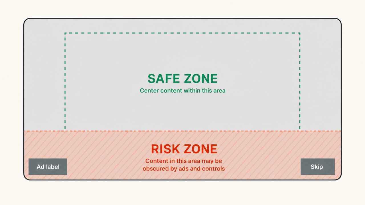
The most common format. It plays before, during or after a video at 1920 x 1080, and viewers can skip after 5 seconds.
What covers your video:
- Bottom-left: the "Ad" badge and advertiser name, about the bottom 10% of the height and 30% of the width
- Bottom-right: the Skip button, from second 5 onward
- Bottom: a CTA bar or companion overlay that can take up about 20% of the height when enabled
Keep hook text in the upper two-thirds of the frame and horizontally centred. If you need a logo on screen the whole time, top-right is the safest spot.
The second 5 trap: the countdown and Ad badge are visible from second 0, but the Skip button only pops in at second 5. That is often exactly when editors land a transition or a second hook in the bottom-right. Scrub to 0:05 and check that corner on its own.
Non-skippable in-stream ads (16:9)
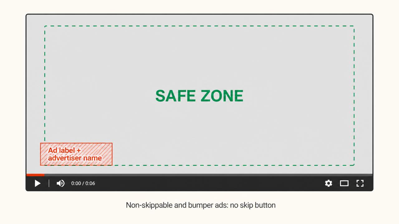
Same 1920 x 1080 canvas, usually 15 seconds (up to 20 in some markets). With no Skip button, the bottom-left badge is the main thing to avoid. Keep that quadrant empty and you are mostly fine.
Since viewers cannot leave, you also do not have to cram everything into the first 5 seconds. The safe zone is the same, but you can pace the story differently.
Bumper ads (16:9, 6 seconds)
Same rules as non-skippable. The difference is the stakes: if the Ad badge covers your logo for 2 seconds, you just lost a third of the ad. One message, centred, nothing in the bottom-left.
YouTube Shorts ads (9:16)
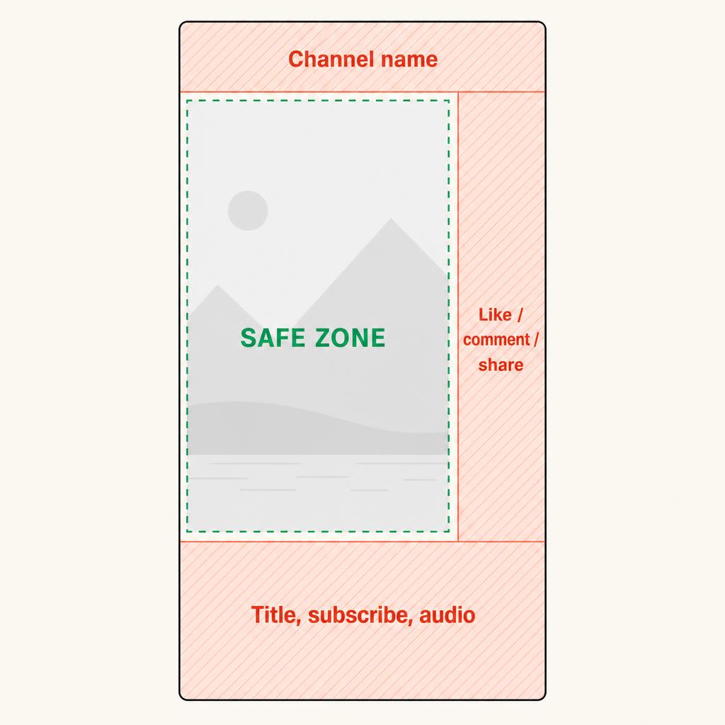
Shorts ads run full screen at 1080 x 1920 between organic Shorts, and the interface is much busier than in-stream:
- Top (200 to 240px): channel name and menu
- Right (about 200px): like, dislike, comment, share and the channel icon
- Bottom (250 to 380px): title, subscribe button, audio info, hashtags and the CTA button
Keep anything important in a box that starts 240px from the top, ends 380px from the bottom, and stays 200px from the right and 60px from the left. That leaves about 820 x 1300px, sitting slightly left of centre.
Two things that catch people out:
- Long titles and handles: a two-line title or long channel name pushes the bottom UI up by another 60 to 100px. Write short titles, or leave extra room.
- Demand Gen CTA bars: Demand Gen ads on mobile add a large rectangular CTA button that sits higher than the organic Shorts UI. If you run the same cut in Demand Gen, raise your bottom margin.
Never put text or product in the bottom-right corner of a Short. It is the busiest spot in the whole YouTube interface.
YouTube Shorts vs TikTok safe zones
Most brands repurpose TikTok ads for Shorts, and the zones are close but not identical. YouTube's bottom title area tends to be taller, and its action column sits slightly differently on the right. A caption that fits TikTok's safe area can end up partly under the Shorts title. If you are reusing a TikTok cut, move bottom captions up by around 100px before uploading.
TV vs mobile
A big share of YouTube watch time now happens on TV screens. On TV there is no right-hand action column on Shorts, but TV interfaces and overscan can clip the outer edges of the frame. Mobile is still the stricter case, so if your ad works on a phone, it will usually work on TV. Just keep text away from the very edges.
How to set up safe zone guides in your editor
- Premiere Pro: in the Program Monitor, open the wrench menu and turn on Safe Margins. For Shorts, drop a transparent 1080 x 1920 PNG with the margins above on the top track and lock it.
- DaVinci Resolve: in the viewer, go to View > Safe Area and enable it, or add a custom guide overlay image on the top track.
- CapCut: there are no YouTube presets, so import a transparent guide PNG as an overlay and disable it before export.
- Figma: build a 1080 x 1920 frame with the margins as a locked layer and design your text cards inside it.
Why it matters for performance
Safe zones are not a compliance issue. YouTube will still serve your ad. The problem is that a covered element silently drags results down:
- Half your hook is under the Ad badge, so viewers miss the point and skip.
- Your end CTA sits behind the Skip button on mobile, where most people watch.
- Your product is framed under the Shorts action buttons and is effectively invisible.
You will not spot any of this in a desktop preview. It only shows up on the real player.
Final check before launch
Export stills at 0:01, 0:05 and the last second of each cut, lay your guide over them, then watch the ad once on your phone in the YouTube app. For Shorts, look at the bottom-right corner on its own.
To see how high-spending brands frame their hooks and CTAs in practice, browse the VidSniff YouTube Ad Library. It includes real Shorts and widescreen ads, including unlisted creatives. For more inspiration, see our ecommerce ad examples and these YouTube advertising best practices.